
Collaborative design tools promise to close the gap between how a product looks and how it gets built. Figma has done more than most to actually deliver on that promise: it moved UI and UX design entirely into the browser, made real-time multiplayer editing a default expectation, and built a handoff layer that lets developers inspect, annotate, and export without ever opening a separate application. For product teams building digital products, it has become the dominant choice not because it is flashy, but because it genuinely changes how designers and developers work together. The platform earns a strong 4.29 overall, with particular strength in functionality and integrations.
The mechanism driving Figma's usefulness is its combination of a shared canvas and a structured component system. Every edit you make is visible to collaborators in real time, but the deeper value comes from how components, variables, and Auto Layout interact. A well-structured Figma file lets you change a single colour token and watch that change propagate across every screen in the project. Variables allow you to define values once and bind them to elements throughout your design, so switching between light and dark themes or desktop and mobile layouts takes seconds rather than hours. Most teams underuse this layer entirely, which is the most common reason their files become hard to maintain as the product grows. Setting up a token and variable system before you design your first screen is the single decision that separates files that scale from files that become liabilities.
Realistic expectations depend on what you bring to the tool. A solo designer building a marketing site can get a polished, shareable prototype in a single day. A product team maintaining a multi-brand design system will spend weeks setting up the variable and component architecture before the investment pays off. Figma does not short-circuit that setup time, and it should not. The payoff is that once the system is built, shipping new screens becomes much faster because the building blocks already exist. Teams that treat Figma as a drawing tool rather than a system-building environment will see output velocity stall as the product grows.
Figma is specifically built for product designers, UX leads, and cross-functional teams working on digital products: apps, web platforms, SaaS dashboards, and anything where design and engineering need to stay tightly aligned. It suits companies where multiple people need to interact with a design file simultaneously, whether they are editing, commenting, or inspecting code output. Founders building their first product will find the free tier sufficient for early-stage work, while teams of three or more will quickly hit the file limits on the Starter plan and need to evaluate paid options.
The clearest limitation is cost at scale. Figma's seat-based pricing model, updated to include Full, Dev, and Collab seat types, means costs compound quickly as you add team members. The top-tier Enterprise seat runs to significantly more per month than most comparable tools, and annual-only billing at the Organisation and Enterprise tiers removes the flexibility to scale down. Freelancers working across multiple client workspaces have historically found the billing model awkward, though Figma has indicated improvements to how agencies and freelancers manage cross-workspace collaboration are on the roadmap.
The sections below cover how the tool works mechanically, which features matter most in practice, and where Figma loses ground to alternatives like Webflow and Notion in adjacent workflows.
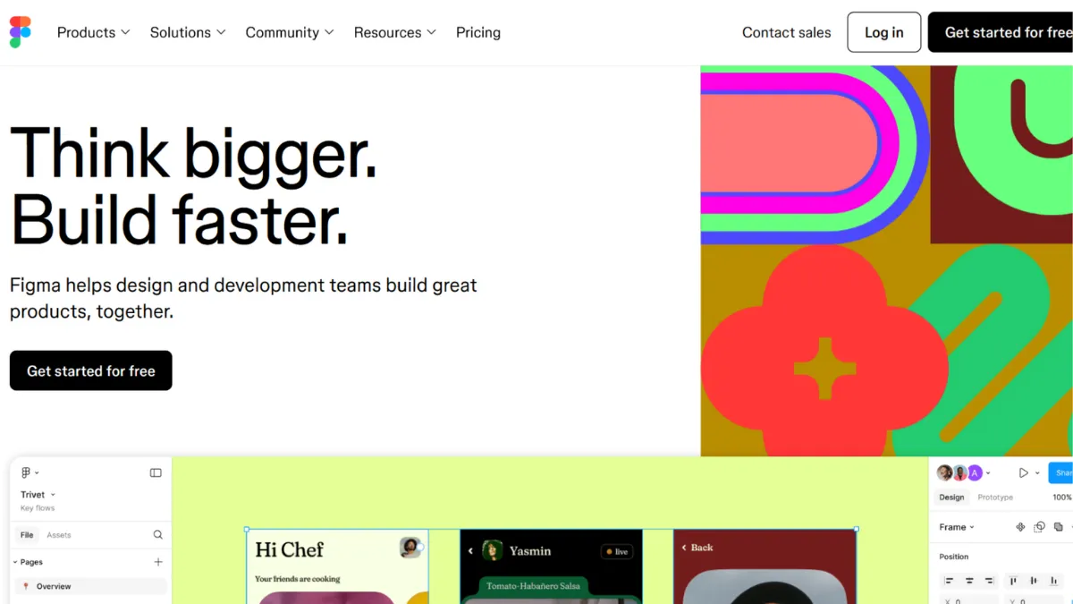
What Is Figma?
Figma is a browser-based interface design and prototyping platform that lets teams design, collaborate on, and hand off digital product work from a single shared environment. Where older tools like Sketch required a local Mac application and manual file sharing, Figma moved the entire canvas to the cloud, so every team member always works from the same live file. Its core advantage over generic alternatives is the depth of its component and variable system, which lets design teams build reusable, token-driven systems rather than isolated screens. Figma has grown to include FigJam for whiteboarding, Figma Slides for presentations, and Dev Mode for developer handoff, making it a broader product suite than a simple design tool. The platform is widely adopted across product teams at companies of every size. How it achieves that depth of output quality comes down to a set of interlocking mechanics that reward structured thinking.
How Figma Works
Figma files live in the cloud and open in any modern browser, with optional desktop apps for Mac and Windows that offer modest performance benefits. The canvas is infinite, so teams typically organise work by page: one page for the design system, one per product area, and one for prototyping flows. Every element you place on the canvas can be converted into a component, which behaves like a master template. Instances of that component can be placed anywhere in the file; changes to the main component cascade through every instance automatically.
Auto Layout is the feature that most dramatically changes how designs are built. Frames with Auto Layout active resize dynamically as content changes, which means a button containing text will always fit its label, and a list of cards will always space itself consistently. This sounds minor until you have fifty screens all using the same card component and need to change its padding. Without Auto Layout, you update every card manually. With it, you update the component once. Pair this with Figma's variable system, which stores design tokens like colours, spacing values, and typography scales, and you can maintain a multi-theme product from a single source of truth.
Dev Mode gives developers a separate view of the same file. They see specifications, CSS output, and any links to Storybook, GitHub, or Jira that the design team has attached to components. This eliminates the round-trip where a developer asks what font size a heading uses. The counterintuitive truth about Figma is that the quality of what developers receive is almost entirely determined by how rigorously the design team structures the file. A poorly organised Figma file produces confusing Dev Mode output regardless of how powerful the inspection tools are. The practical question S4 addresses is which specific features drive that structural quality.
Figma Key Features
Auto Layout and Responsive Frames. Auto Layout turns static frames into dynamic containers that adjust as their content changes. You can set padding, gap, and direction rules so that components resize predictably across screen sizes. The practical value for product teams is that a single button component handles short and long labels without manual adjustment, and entire page sections reflow correctly when content is added or removed. Use it well by applying Auto Layout at the component level first, then nesting those components into page-level frames. Teams that apply it only at the page level and skip it at the component level lose most of the benefit.
Variables and Design Tokens. Variables let you store named values, colours, spacing, radii, opacity, and more, and bind them to elements across your file. Modes extend this by letting a single variable hold different values for different contexts: a colour token can resolve to one hex value in light mode and another in dark mode. Switch the mode on a frame and every bound element updates instantly. This is the feature most teams delay learning and most regret not using from the start. It is the foundation of any design system that needs to support multiple themes, brands, or platforms from one file.
Prototyping and Interactive Components. Figma's prototyping layer lets you connect frames with transitions, define hover and pressed states within components, and share a clickable prototype link with stakeholders or researchers without exporting anything. Interactive components mean that a dropdown or toggle can demonstrate its full behaviour inside a prototype rather than requiring separate static screens for each state. The output is good enough for usability testing and executive reviews, though complex micro-interactions still require a dedicated tool like Runway for motion design or a code-based prototype.
Dev Mode and Code Connect. Dev Mode gives engineers a focused view of designs marked ready for development, showing spacing, colour values, typography specs, and code snippets. Code Connect, a newer capability, links Figma components to their actual code implementations, so developers see real component code rather than generated CSS approximations. This is most valuable for teams with established component libraries in React or other frameworks. The feature requires setup from the engineering side, but teams that invest in it reduce the cost of designer-to-developer communication significantly.
FigJam and Collaborative Whiteboarding. FigJam is Figma's whiteboard product, included across paid seats. It provides sticky notes, voting tools, diagrams, and templates for workshops and discovery sessions. Its relevance for product teams is that early-stage thinking, user journey mapping, and sprint planning can happen in the same ecosystem as the design work, reducing context-switching. For teams already using tools like Miro or Notion for planning, FigJam may feel redundant. That overlap is the trade-off worth knowing before assuming the all-in-one billing represents full consolidation. The question of which platform to consolidate on depends on where your team's non-design work already lives.
Figma Pros and Cons
Figma's strengths are substantial, but the platform also carries real friction points that affect specific team types.
- Best-in-class real-time collaboration. Multiple editors can work in the same file simultaneously with no conflicts or version-control issues. This is the feature that made Figma the standard for cross-functional product teams and remains its clearest technical advantage over desktop-only tools.
- Deep component and variable system. The combination of components, variants, and variables supports genuinely scalable design systems. Teams that invest in the architecture see meaningful time savings as their product grows in complexity.
- Browser-based with no OS restriction. Figma runs on Mac, Windows, and Linux through the browser. This removes the friction of tool access for teams with mixed operating system environments, which is common at fast-growing companies.
- Dev Mode reduces handoff friction. Developers get structured access to specifications without needing a full editor seat, and Code Connect can surface real component code alongside designs. The reduction in back-and-forth during implementation is tangible for teams that use it properly.
- Large plugin and community ecosystem. The Figma Community provides free component libraries, icon sets, and templates. The plugin library covers accessibility checking, content generation, and workflow automation. This ecosystem reduces setup time considerably for teams starting new projects.
The platform also carries limitations that matter depending on your team size and workflow.
- Pricing complexity at team scale. The seat-based model with multiple seat types and tier restrictions means costs can escalate sharply as a team grows. Organisation and Enterprise plans require annual billing, removing the ability to scale down seasonally or trial a tier before committing.
- Performance on large files degrades. Files with hundreds of components, deep nesting, and many pages can become slow to load and navigate. Teams maintaining large design systems often split their work across multiple files linked by published libraries to manage this, which adds organisational overhead.
- Steep learning curve for the variable system. Auto Layout and variables are powerful but require deliberate study. Designers accustomed to static tools typically need several weeks before the system clicks. The absence of structured in-app onboarding for these features means most teams learn through community tutorials rather than official guidance.
- Prototyping lacks advanced animation. Figma's prototyping is strong for flow and interaction testing but limited for motion-heavy interfaces. Teams building products where animation is central to the experience need a supplementary tool.
- Freelancer billing model remains awkward. Managing work across multiple client organisations requires navigating separate workspaces and seat allocations. Connected Projects, which would ease this, was still in progress at the time of writing.
How to Get the Most Out of Figma
Before opening the canvas, set up your file structure. Create a dedicated page for your design system: define your colour tokens as variables, establish your type scale, and build your core components before designing a single product screen. Teams that skip this and design directly in production pages create debt they spend months paying down later.
In your first week, prioritise Auto Layout over visual fidelity. It is tempting to position elements manually because it is faster at first. Resist this. Every component you build with proper Auto Layout rules will save you time across every screen that uses it. Set padding and gap rules explicitly, and test each component by resizing its container before you move on.
Building results over time means treating your Figma file as a living system, not an archive. Publish your component library to your team and establish a review process for changes to core components. When a component changes without team awareness, downstream inconsistencies accumulate. Assign one person, typically the most senior designer or a design systems lead, responsibility for approving changes to published libraries.
The mistake most teams make is treating Figma as a screen-drawing tool rather than a system. They design every screen from scratch, duplicating elements rather than using components, and wonder why updates take so long. The compound return on a proper component system only becomes visible after the third or fourth iteration cycle, which is why the investment feels unnecessary until it suddenly becomes urgent.
To measure success, track how long it takes to produce a new screen for an established product area. A mature Figma system should let an experienced designer assemble a new screen from existing components in under an hour. If new screens consistently require creating new components from scratch, the system has gaps. Use the Figma Community's published design system templates as a benchmark for what a mature file structure looks like. Teams asking how to build a scalable UI design system will find the answer is almost entirely in how variables and component hierarchies are structured from day one.
Who Should Use Figma?
Figma suits you if you are a product designer or UX lead working on a digital product where designs feed directly into an engineering team. The handoff workflow, particularly Dev Mode and Code Connect, is built for this relationship. If you are building a SaaS product, a mobile app, or a web platform and your developers currently receive designs as static images or PDFs, Figma will materially improve that process.
You will also get strong value if you are a design systems lead responsible for maintaining a component library used by multiple designers or product teams. The variable and component architecture scales to this use case better than any comparable tool. Teams managing multiple brand expressions from a single source of truth will find the multi-mode variable system particularly useful.
Figma is also a sound choice if you are a founder or early-stage product lead who needs to share high-fidelity prototypes with investors or user research participants without building anything in code. The prototype share link requires no account to view, which removes friction in stakeholder reviews.
It is not the right tool if you are primarily producing marketing graphics, social media assets, or print materials. Canva handles that workflow more efficiently with far less setup overhead. Similarly, if your design output is a website and you intend to publish it directly without a separate development step, Webflow lets you design and publish in one environment, removing the handoff process entirely. Figma's strength is the design-to-engineering pipeline; if that pipeline does not exist in your workflow, the platform's depth becomes unnecessary complexity.
Figma Pricing
Figma offers a Starter plan at no cost, which supports up to two editors, limits collaborative files to three per team, and includes access to FigJam and Figma Slides at a basic level. For solo designers or founders validating an early product, the free tier covers the essentials. The file limit becomes the first constraint as a project grows.
Paid plans are structured around seat types introduced in the updated billing model. Full seats give access to all tools including Dev Mode, FigJam, and Slides. Dev seats are designed for engineers who need to inspect designs and export specifications without full editing access. Collab seats sit between viewer and full editor access. Pricing across these seat types and plan tiers varies, and Organisation and Enterprise plans moved to annual-only billing, which affects flexibility for smaller teams evaluating whether to commit. Check Figma's pricing page directly for current rates, as the seat structure and prices have been revised and may continue to change.
The free tier is sufficient for a single designer working on early-stage product work. Once a team of two or more designers needs to collaborate seriously, the Professional plan covers the essentials. The jump to Organisation or Enterprise is justified by the need for centralised asset libraries across multiple teams, advanced admin controls, or enterprise security requirements. Relative to alternatives, Figma's per-seat cost sits above some competitors, which makes the comparison with tools like Penpot and Sketch relevant depending on team size and budget.
Figma vs Alternatives
Sketch is the historical incumbent Figma displaced. It remains a capable tool for macOS-only teams that prefer a native desktop application with local file storage. Sketch's prototyping and collaboration features are less developed, and its browser-based sharing requires third-party tools. Choose Sketch if your team is small, Mac-only, and prefers offline-first file management. Choose Figma when real-time collaboration and cross-platform access matter.
Penpot is a free, open-source alternative that runs in the browser and supports vector editing, component libraries, and interactive prototypes with no per-seat fees. Teams with strict data sovereignty requirements can self-host it. Penpot's component system is less mature than Figma's variable and token architecture, and its plugin ecosystem is smaller. Choose Penpot if budget is the primary constraint or data residency requirements make a hosted SaaS tool impractical.
Framer occupies an interesting adjacent position. It targets designers who want to publish interactive websites directly from their design tool, effectively combining design and publishing in a way Figma does not. Framer lacks Figma's design system depth and is less suited to teams handing off to a separate engineering team. Choose Framer if your output is a marketing site or portfolio rather than a product feeding a development pipeline.
Webflow is worth considering if the end goal is a published website and you want design, CMS, and hosting unified. Figma's Figma Sites feature moves in this direction but remains limited compared to Webflow's publishing and CMS capabilities. For teams with a dedicated engineering team building a product, Figma wins on handoff depth. For teams publishing a website without a developer, Webflow eliminates the handoff step entirely.
Figma Review: Final Verdict
Figma earns a 4.29 overall score, a result that reflects genuine excellence in functionality (4.8) and integrations (4.6) alongside a cost-efficiency score of 3.8 that reflects the real friction its updated seat-based pricing creates for smaller teams and freelancers. No other tool in the category matches its combination of real-time collaboration, design system depth, and developer handoff capability at this level of polish.
The bottom line: if you are building a digital product with a design and engineering team, Figma is the right tool. Set up your variable and component system before you design a single screen, and the platform will pay back that investment many times over.
How We Rated It:


More Tool Reviews

Latest Blogs
AI tools for business: how to build your stack
Workflow automation: how to identify what to automate and get it running
AI for small business: the tools worth using and how to get started
AI marketing automation: the tools that save time without sacrificing quality
Subscribe to Stay in the loop
Get the latest AI and technology news, honest tool reviews, and practical guides delivered straight to your inbox.
Success! Check your Inbox!
Tezons Newsletter
The latest technology news, in-depth tool reviews, and practical guides - curated and delivered to your inbox.
Latest News


Have a question?
Still have questions?
Didn’t find what you were looking for? We’re just a message away.